OUGD601 - Evaluation

Evaluation

To what extent are streetwear brands reliant on advertising and promotion through social media?

Overall OUGD601 was a big step up from my work in previous ‘context of practice’ modules as it was a more academic. I am please with the outcome of my dissertation as I felt like I started with a large body of research, which I believe helped me achieve a strong conclusion. I am also proud of my practical as I felt that it linked in well the research gathered from my dissertation and my own beliefs. As well as my dissertation and my practical, I also believe that I have a very strong synthesis as my dissertation, practical and my ‘extended practice’ work all have strong connections. This is going to help me develop my practice as I can now design with a large body of research influencing my work.

For the dissertation, my research methods consisted of a case study of the brand Rolex to held define the term ‘brand’. A face-to-face and online survey was held to gather an understanding of the relation between streetwear and social media. Many books, online journals, articles and websites will also be read to gather greater information for each of the topics discussed within this dissertation. I chose to use these research methods, as it was a good mix of first hand and second hand research which I felt was appropriate to my dissertation subjects.

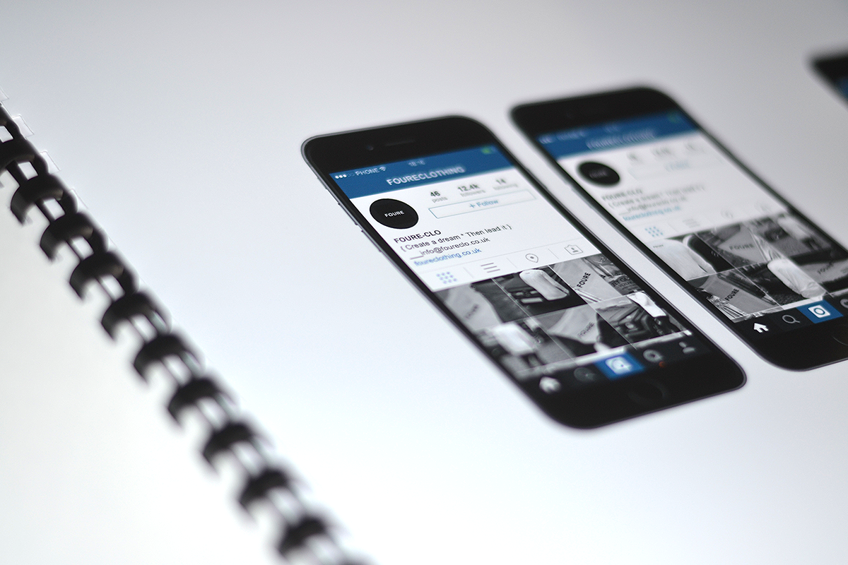
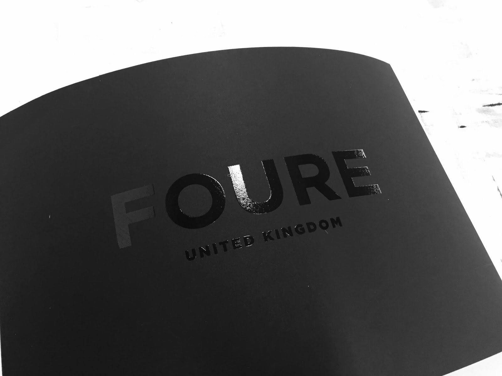
As the main topics of my dissertation are branding, streetwear, social media and the theory of ‘Othering’, which the research gathered, I decided to brand my own streetwear company ‘FOURE’.

The company was set out to be a ‘Luxury streetwear brand’, which was inspired through Hip-hop culture, the items would be of better quality at an affordable price range for a young target audience, which again linked to the research within my dissertation.

For this design brief, I managed to complete the branding guidelines, a branding guidelines publication, a manufactured sample t-shirt, a photoshoot targeted at social media and luxury packaging.

I am pleased with the outcome of all my practical elements within this brief and I feel like the brand is now ready to progress. This will now link into the ‘design practice’ module, as the Spring/Summer collection will be designed, developed and produced as a brief.

My highlights of this module have creating the black foiling on the ‘luxury box’, as well as having a piece of clothing that I have branded and design myself being produced. Black foiling was something that I had never use before, therefore I was slightly worried that it would not look professional and I had only one ‘luxury box’, so I could not fail. However, after many practice attempts on card, the box turned out to be a success and I am defiantly pleased with the outcome.

If I was to have more time or re-do any part of my practical, I would change some elements of the brand guidelines book. Although I am really happy with the design of the book, some problems occurred when binding. The first was that the ‘Instagram mockup’ page did not bind properly. Therefore it will make the book look slightly unprofessional. The second problem was that was that I could not find a black metal spiral bind, so I had the choice of black plastic or silver metal. I ended up choosing the black plastic as this is the colour I wanted to fit with the box, however I would of preferred it to be black metal.

As a whole, I am really happy with my dissertation, practical and my synthesis, as I believe that they work all have extremely strong links. I am very pleased I chose my dissertation topic, as my research and conclusion will majorly influence my design work in the future.

Thursday 14 January 2016 by James Smith
Categories: , | Leave a comment

OUGD601 - Practical - Branding book - Finals

Final branding book - Printed

I photographed my final product in the LCA photography sudio using my Nikon D3100 with a 50mm AF-S Lens.

(Mentioned in previous posted)
Three problems occurred when creating the brand guidelines publication... 

• One page ‘Instagram mockup’ did not bind correctly. 
• The book had a slight bend in it. 
• A plastic spiral had to be purchased as there was  no metal spirals which was black and black was  the colour preference.

Cover

Printed in LCA print room, satin stock printed in they, with a white logo.

These colours have been chosen so the publication stands out in the black box.


Cover photographed with luxury projects.

Cover x Yeezy 350 Moonrocks.


Inside pages.

The quality of print came out perfect as all the image quality was kept with a slight gloss finish.


The colour swatch page was a worry because the print needed to come out perfectly to show the correct colours. 

This page also can out with high quality and all the colour swatches are solid.


This is a high quality photograph, focusing on the finer detailed prints, which again came our perfectly.


Problem 1.

This photograph shows that the book had a slight bend in it. 

This will be attempted to be solved by pressing the publication flat for a long period of time.


Problem 2.

This photograph shows that the ‘Instagram mockup’ did not bind correctly. 

Unfortunately this problem cannot be solved due to the print room being fully booked until after the hand in time. 


Final logo on the cover page with the sample t-shirt in the background.

Tuesday 12 January 2016 by James Smith
Categories: , | Leave a comment

OUGD601 - Practical - Branding book - Process

Branding book - Process

The binding method used on this publication was a spiral bind, to give the publication a ‘fashion look book’ style.  

Three problems occurred when creating the brand guidelines publication...

• One page ‘Instagram mockup’ did not bind correctly.
• the book had a slight bend in it.
• A plastic spiral had to be purchased as there was  no metal spirals which was black and black was  the colour preference.


Step 1.
The publication was printed using the LCA print room, at a scale of A1, on satin paper.


Step 3.
Cutting down the A1 paper into the A3 booklet.


In my opinion, the print quality came out perfectly, I tested this by seeing how the colour swatch page turned out because I could match up the colours printed to colours on screen.


Step 4.
Spiral stitching the publication.

This took place in the LCA library.

I have never done this method before, so I will test out how the machine works first on sample papers.


Step 4.
Close the spiral & lift to complete.


Monday 11 January 2016 by James Smith
Categories: , | Leave a comment

OUGD601 - Practical - Branding book - Design

Branding book

Final branding book - Digital

The publication layout was designed using the Adobe suite and printed out on A1 satin paper, using the Leeds College of Art, digital print. The were then cut down to A3.

These pages are explained in the 'Branding Foure' posts.

Cover.


Page 1.
An introduction to the brand.


Page 2.
Inspirational items and 'Foure' samples.


Page 3.
Inspirational luxury lifestyle and items.


Page 4.
Branding - Typeface.


Page 5.
Branding - Colours.


Page 6.
Website mockup.


Page 7.
App mockup.


Page 8.
Social media photoshoot - Luxury cars.


Page 9.
Social media photoshoot - Luxury products.


Page 10.
Luxury packaging.


Page 11.
Promotion - Instagram mockups.

Sunday 10 January 2016 by James Smith
Categories: , | Leave a comment

OUGD601 - Practical - Luxury packaging - Finals

I photographed my final product in the LCA photography sudio using my Nikon D3100 with a 50mm AF-S Lens.

Overall I am pleased with the final outcome of this product. The black foiling worked perfectly on the slightly textured box, giving the box a luxury touch.

The box had to be dismantled, however the superglue used worked well to glue it back together.

This box was to fit the A3 booklet inside and the normal boxes for products would be about A4 instead.


Wednesday 6 January 2016 by James Smith
Categories: , | Leave a comment

OUGD601 - Practical - Luxury packaging - Process

Luxury packaging

To create ‘luxury’ element of the brand, boxes will be created for packaging. This is insired by other luxury items like watches, glasses and shoes. The box gives the products a feel of greater value, as well as greater customer satisfaction.

This box was created at a larger scale than the normal boxes would be as It had to be larger than a3 to fit the ‘branding guidelines’ publication inside.  

This box was finished with black foiling, using texiflock as glue and a heat press on 160 degrees for 20 seconds.  

A a3 sheet of card will also be placed on top of the products, also with black foiling, to further the luxury feel to the product. 

The only small problem that occurred during this process was that the box was to large for the heat press, so the box had to be taken apart in order for it to fit. After this, the box was then glued back together using ‘super glue’.

Step 1. 
Screen emulsion 


Step 2. 
Collect box, texiflock, black foiling and print out my negatives.


Step 3. 
Make my positives.


Step 4. 
Text the print method on card.


Step 5. 
Use the textflock as the glue.


Step 6. 
Wait for the glue to dry.


Step 7. 
When dry, add black foiling and place in heat press for 20 seconds on 160 degrees.


Step 8. 
Peal the black foiling off using the corners.


FINAL TEST FINISH

This method turned out success full. After a few test prints the final box will be ready to be printed.


Pealed foiling.


PROBLEM!!

The box is too big for the heat press. Therefore I am either going to use an iron instead of the heat press, or take the box apart so it is able to fit.

Step 9. 
Test the iron printing method.

Thoughts?
I am not happy with the outcome of this foiling as all the foiling did not stick to the card. Therefore I will find a way to make the box fit into the heat press.


All final samples.

One seat will be used to be placed other the products in the box, to add a luxury feel to the product, as the consumer would have to reveal the product from underneath the printed sheet.


Step 10. 
Take the box apart in order to in to be able to fit in the heat press.


Step 11. 
Apply texiflock to the box.

NOTE!! 

The box is textured. It is really important to press down hard on the screen, so all the texiflock is applied onto the box.


Step 12. 
Apply black foiling and heat press for 20 seconds at 160 degrees.


FINAL LUXURY BOX DESIGN

Tuesday 5 January 2016 by James Smith
Categories: , | Leave a comment